Related


 Design")
Next Steps
Isedo Therapy Identity
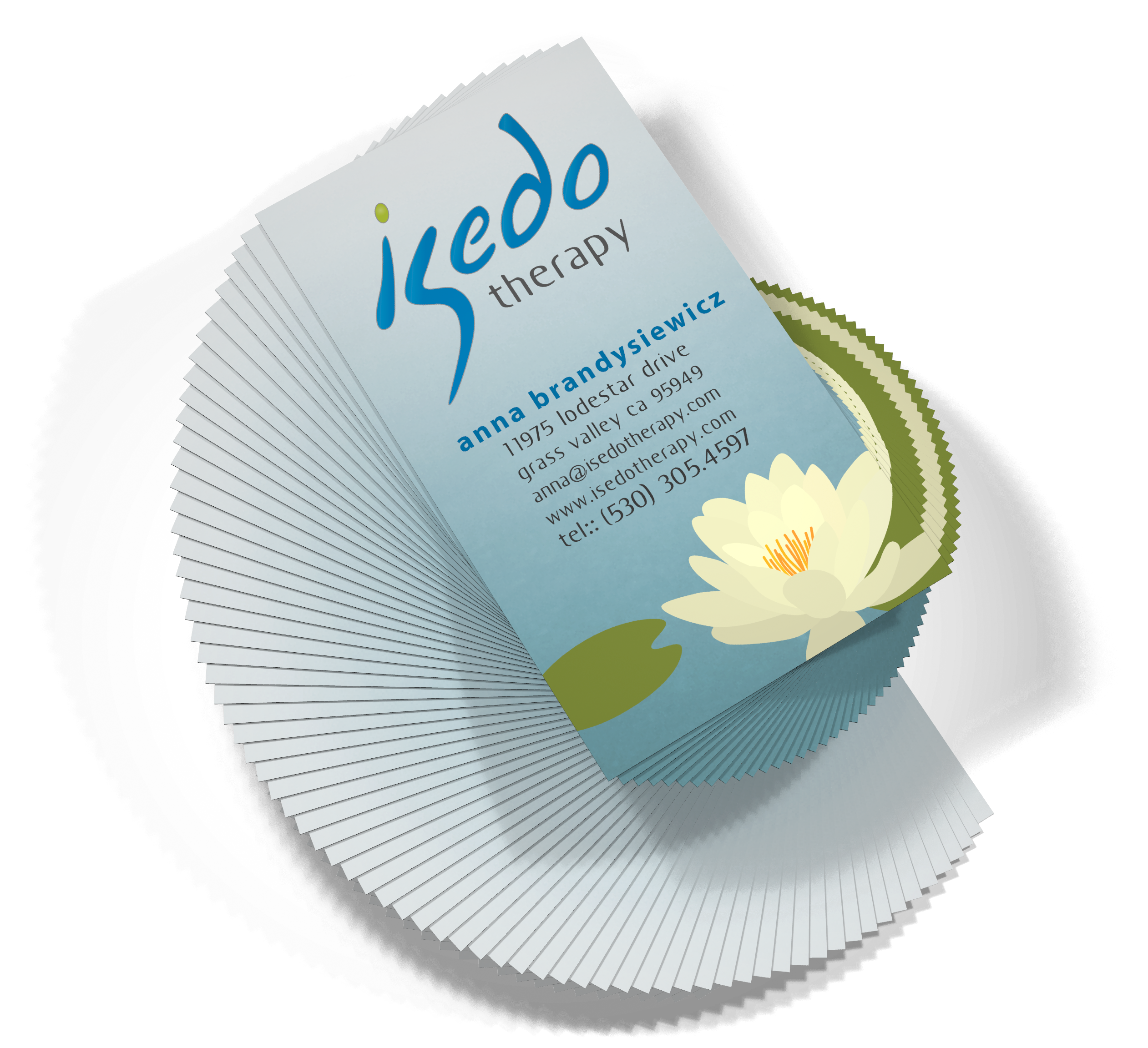
Brand identity for an alternative healing service. The brand name "Isedo Therapy" was created together with a company logomark to communicate the concept of therapy through personal balance.
The Brief:<
Create a company brand identity that includes a company name, logo mark, business card, and stationery. The company provides a service that facilitates healing through directed use of pressure point stimulation and talk therapy combining elements of Reiki, Qi Gong and regression therapy.
The Concept:<
The name of the company is a combination of "I" - as in the person, and the Latin word "sedo" - which means to settle, smooth and calm. The pronunciation (eye-saydoh) uses the concept of onomatopoeia with an abrupt start and a smooth trail off to evoke the calm felt after successful therapy.
The color palette is indicative of a modern lively style with harmoniously balanced hues and luminosities. The visual weight of the logo mark is balanced to indicate stability whilst the elongated S and D characters suggest a curved path as a change of direction.
The lotus garden illustration on the business card and stationery further reinforce concepts of tranquility through calm and balance. The illustration also alludes to Reiki and Qi Gong, which are used as part of the therapy process, through their Asian origins.
![]()
![]()