Related


Next Steps
United Technologies Corporation (UTC) Identity Design
The Brief:<
As a family of companies, UTC requires a unified brand identify, but using one mark for all the companies does not communicate the strengths of the individual companies. Conversely, using multiple marks can reduce the effectiveness of communicating the aggregate identity that is UTC.
The Concept:<
The new system of marks has a unified style enforced by the same use of colors, typography and style of rendering. Each of the marks communicates the individual company's purpose, products and persona whilst strengthening each other's identities and that of UTC.
The marks have a style that is unique, captivating and enduring. Only two colors are used to guarantee that the identity can be reproduced across all media without degradation. Even when using black and white reproduction the marks remain strong. Graphic elements are kept to a minimum, in number and complexity, ensuring legibility at any size.
The Solution:<
Typography<
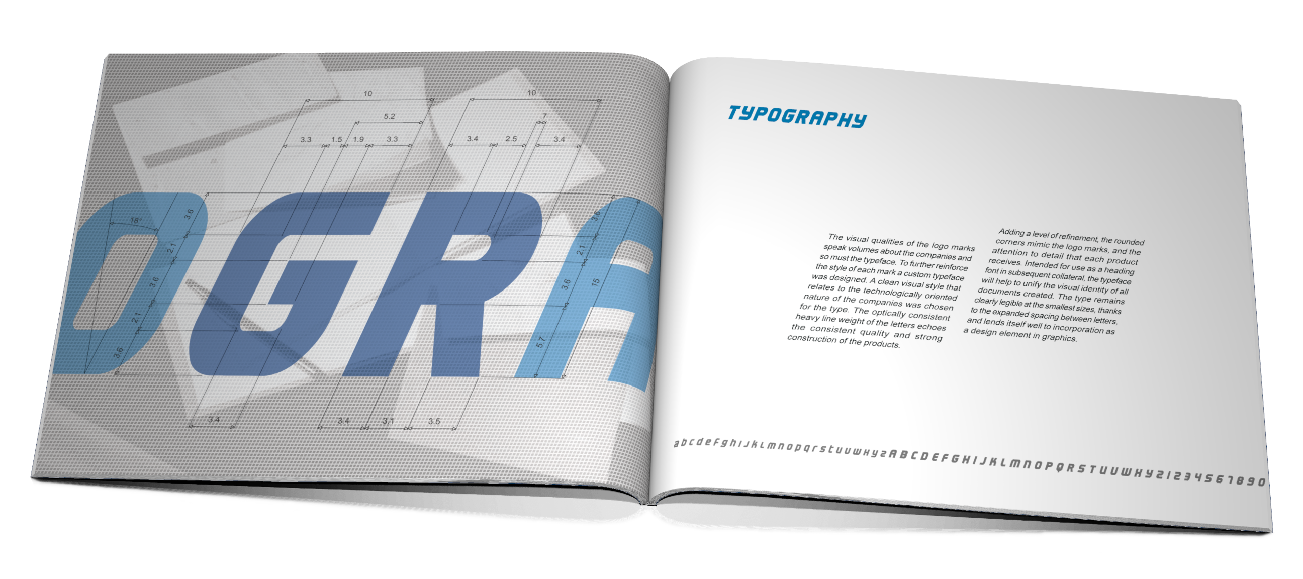
The visual qualities of the logo marks speak volumes about the companies and so must the typeface. To further reinforce the style of each mark a custom typeface was designed. A clean visual style that relates to the technologically oriented nature of the companies was chosen for the type. The optically consistent heavy line weight of the letters echoes the consistent quality and strong construction of the products.
UTC Logo<
![]()
The concept is to portray UTC as the parent company made up of subsidiaries. This is achieved by the combination of the letters U, T, and C is such a manner that the secondary letter T and C are visible individually and combine to form the primary letter U.
The use of alternating figure ground, where the U is visible as the figure against the white background, and then becomes the background for the white T, reveals the creative nature of UTC and its ability to analyze problems from multiple perspectives. The progressive scaling of letters suggest a hierarchy with the U dominant much in the same way that UTC is at the top of the hierarchy of the companies.
Hamilton Sundstrand Logo<
![]()
As a manufacturer of aerospace system components, Hamilton Sundstrand needed a logo to reflect how the combination of parts form a whole, in a similar manner as the UTC mark. The solution was to modularize the letter H into block and connector line elements that have a dynamic relationship.
The blocks represent the components and the connector line is reminiscent of an electrical wire as frequently seen in a schematic diagram. A manipulation of the gestalt principle, with the elements forming a whole, encourages the viewer to first perceive the primary letter H and then switch perspective to form the secondary letter S.
Sikorsky Logo<
![]()
Since Sikorsky solely manufactures helicopters, and the primary identifying element of a helicopter is the main rotor, it is logical to incorporate the rotor into the design. The letter S is abstracted, using a sharp angular style, into the path of a moving rotor.
The secondary elements complete the circular motion and the contrast in tone gives the illusion of movement in the blades. The mark is tilted and rotates in a manner consistent with the appearance of an approaching helicopter adding dynamics to the mark and relating it back to the product.
Chubb Logo<
![]()
This mark focused on Chubb security products. The major elements are the letter C and the mirror image of C. These two elements surround a third minor element, of different tone located in the center, to suggest the protection of the minor element. The major elements are separated by a gap to evoke a dynamic unlocking motion of security doors, with the graphic principles of proximity and similarity, urging the viewer to discern them as parts of a whole object.
Otis Logo<
![]()
The similarity amongst Otis products is the movement of people and objects in defined direction. The letter O is stretched to signify a container object that is surround by arrows indicating its primary directions of movement. By dynamically sloping the logo the remaining diagonal directions of movement are suggested.
The inside contour of the O is more square than the rounder outside to differentiate it as an object within a container. The rounded corners are intended to soften the impression of the logo. This in turn reflects upon the gentle, caring attitude of Otis in ensuring that all items moved with remain safe.
![]()
![]()