Next Steps
Xerox Content Submission Site
Xerox is building a new community of Premier Partners. These partners will have access to a web site that will allow them to communicate with other partners, refer print jobs and obtain valuable documents to aid them in the business.
The Brief:<
Your efforts will focus on the document sharing area known called Knowledge Services. This project is a worldwide effort and is aimed at customers who speak English, French, German, Italian and Spanish. We require a method for internal personnel to create and manage information for the Knowledge Services area. [Detailed specification followed]
The Concept:<
The identity for the main site was already created so this was mainly an information design process. The primary consideration was the use of multiple languages. Not only did the content have to be in multiple languages but the interface needs to interact with multilingual users. This meant that a user could select French for the interface language and then view/edit English and German content. In the end, every element on the page was dynamically generated. The rest of the design focused on providing an informative interface with a clear hierarchical structure for the multilevel content.
The Solution:<
The site was developed from scratch using the Active Server Pages (ASP) scripting language and Microsoft SQL Server Database for content storage. A modular programming approach was used to allow easy re-use of code.
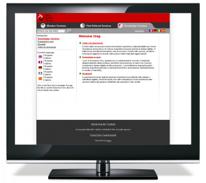
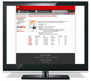
Content Submission Site Welcome Screen<
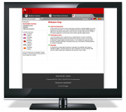 The administration interface mirrored the end users view of the site apart from a drop down menu (in the top left) that provided access to primary administration operations. A side menu displays content categories and expands and contracts depending on the selected level. Below that is a summary of content, for each language, indicating the counts of sub-levels and content objects. The interface language can be changed using the flags in the top right.
Object Preview page<
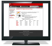 Content items (objects) contained many pieces of information to allow for multiple hierarchy display and detailed searches. Each language translation contained fields for Language, Title, Intro Text, Full Text Description, and downloadable file (if applicable). A translation could be entered by any content editor but the original content creator had approval privileges and override editing capabilities.
The original content editor entered the core object information shared by all languages which included:
- SKU
- Content owner ID
- Thumbnail image
- Xerox Quadrant
- Country of origin
- Tool Type
- Version Number
- Visibility level
- Knowledge level needed to implement
- Industries to which the item relates to
- Xerox products used
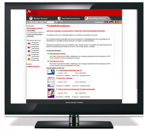
Program Preview Page<
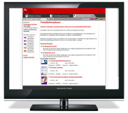 This sample category (program) page displays the complete end user browsing navigation. At the top of the left column a breadcrumb trail indicates the current position in the site. In the main content area we can see the current content program description, with two sub program titles and intro texts. Below that are the object thumbnails and summary info. All red links could be clicked on to reveal more information. The green and yellow dots next to the Titles indicate the object status. Green is for published in multiple languages, yellow for published in one language, and red for unpublished.
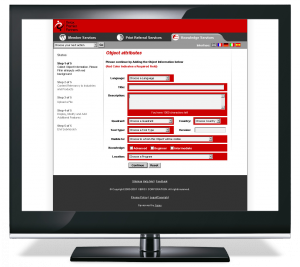
Object Submission Form<
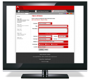 This input form is used to enter the primary object information. The left column illustrates the input process and the current step of input. The main area shows the predefined input fields with all red fields marked are required. The text area features client side JavaScript character count limitations. All fields employed client and server side user input verification rules. Each step of the input process stored the information in browser cookies and temporary tables in the database to ensure that user input was never lost and all information required to publish the item could be entered without overwhelming the content editors.
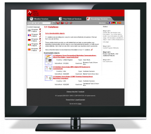
Content Editor Administration Interface<
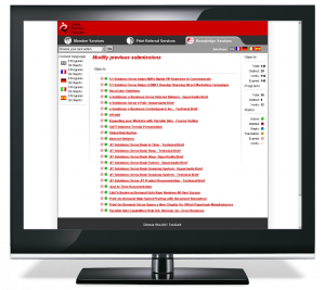
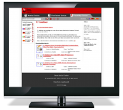 The content editor interface uses context sensitive icons to provide editing and delete capabilities. The left column shows the counts of sub categories and content items by language. The right column indicates the current step in the content editing/input process.
A content sensitive drop down menu contained all editor actions. This was complemented by icons for frequently performed actions. They included:
- Gift box icon to create a new content item
- Group of boxes to create a new category
- Mouth icon to create a translation
- Red X to delete content
- Pencil Icon to edit existing content
Content Summary Administration Page<
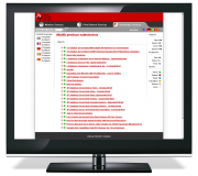 This administration page lists all the content the editor has created. After the initial site was created it was decided that content items should be periodically reviewed to ensure that they are still relevant. The left column indicates the counts of objects and programs that the content editor has submitted. The right column reveals the counts of Total translated objects, distinct objects, Objects that need to be verified, and objects that have expired. The main area displays a list of all objects and programs. The colored dots now indicate the health of the content item with an new blue icon for empty categories that do not contain objects. A new crossed out circle icon show items that have expired and need to be reviewed where they can be reactivated or removed. A yellow check mark indicated new content translations that are awaiting verification (publishing approval).
